datachartpng
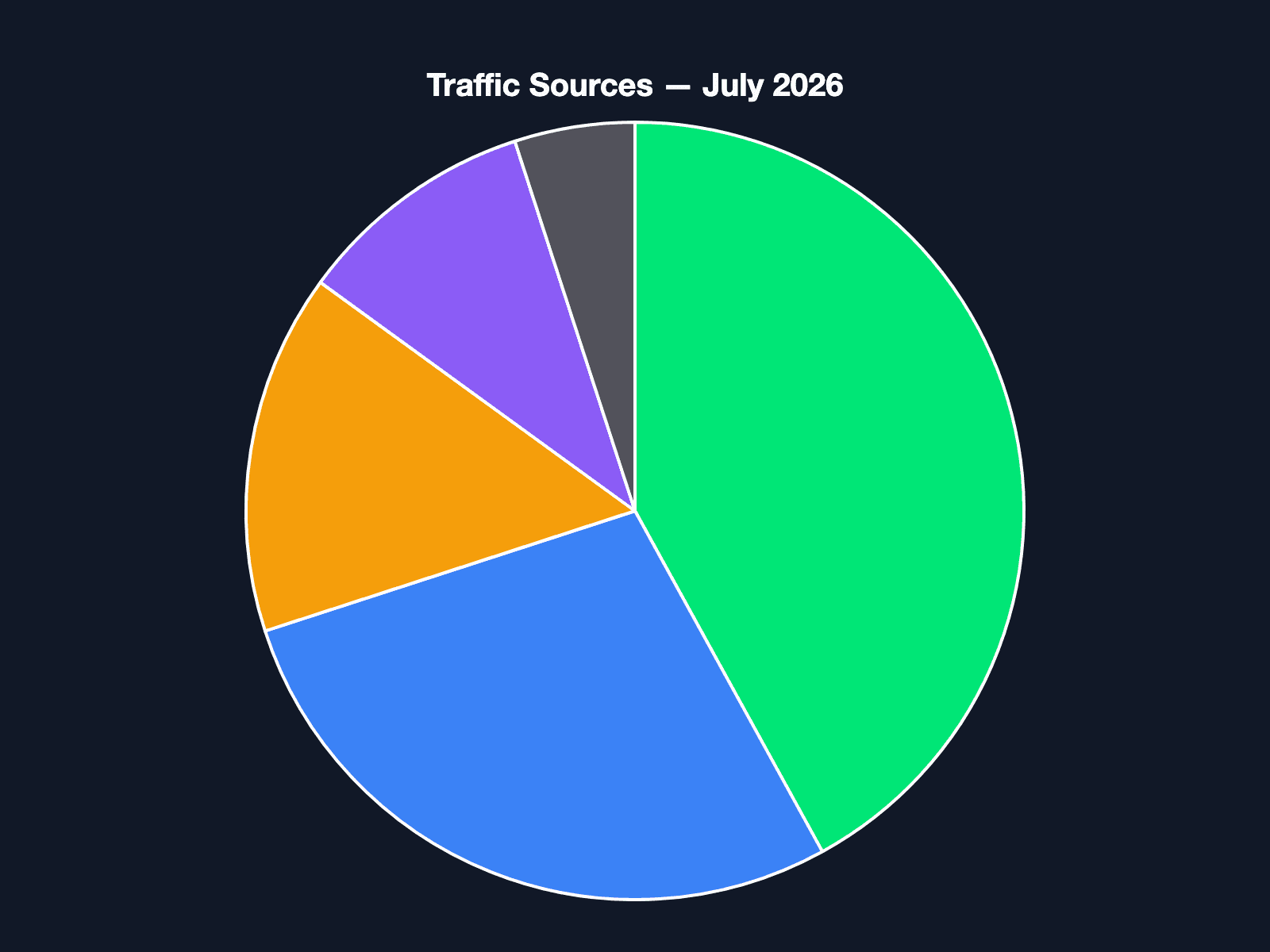
Pie Chart — Traffic Sources
Visualise distribution data as a clean pie chart. Great for presentations and weekly digests.
Request body
{
  "type": "chart",
  "content": "{\"type\":\"pie\",\"title\":\"Traffic Sources — July 2026\",\"labels\":[\"Organic Search\",\"Direct\",\"Referral\",\"Social\",\"Paid\"],\"datasets\":[{\"data\":[42,28,15,10,5],\"colors\":[\"#00e676\",\"#3b82f6\",\"#f59e0b\",\"#8b5cf6\",\"#52525b\"]}]}",
  "options": {
    "format": "png",
    "dimensions": {
      "width": 800,
      "height": 600
    },
    "scale": 2
  }
}
Code example
curl -X POST https://renderfy.io/api/v1/render \
  -H "Authorization: Bearer YOUR_API_KEY" \
  -H "Content-Type: application/json" \
  -d '{
  "type": "chart",
  "content": "{\"type\":\"pie\",\"title\":\"Traffic Sources — July 2026\",\"labels\":[\"Organic Search\",\"Direct\",\"Referral\",\"Social\",\"Paid\"],\"datasets\":[{\"data\":[42,28,15,10,5],\"colors\":[\"#00e676\",\"#3b82f6\",\"#f59e0b\",\"#8b5cf6\",\"#52525b\"]}]}",
  "options": {
    "format": "png",
    "dimensions": {
      "width": 800,
      "height": 600
    },
    "scale": 2
  }
}' \
--output render.pngOne click. Free tier includes 1 saved template.
More data templates
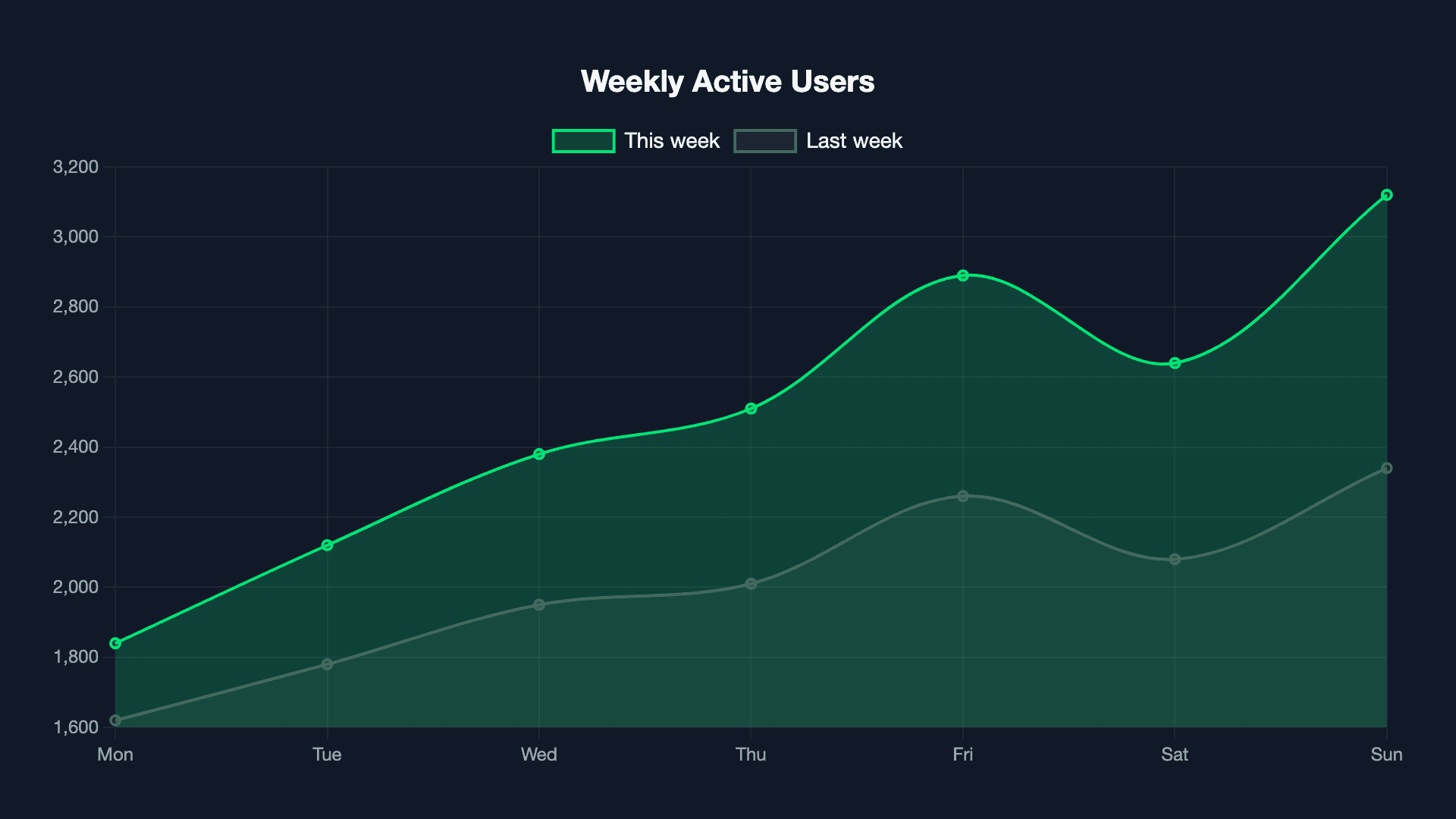
Line Chart — Weekly Metrics
Embed a static chart PNG in emails, Slack, or reports. Chart.js rendered server-side.
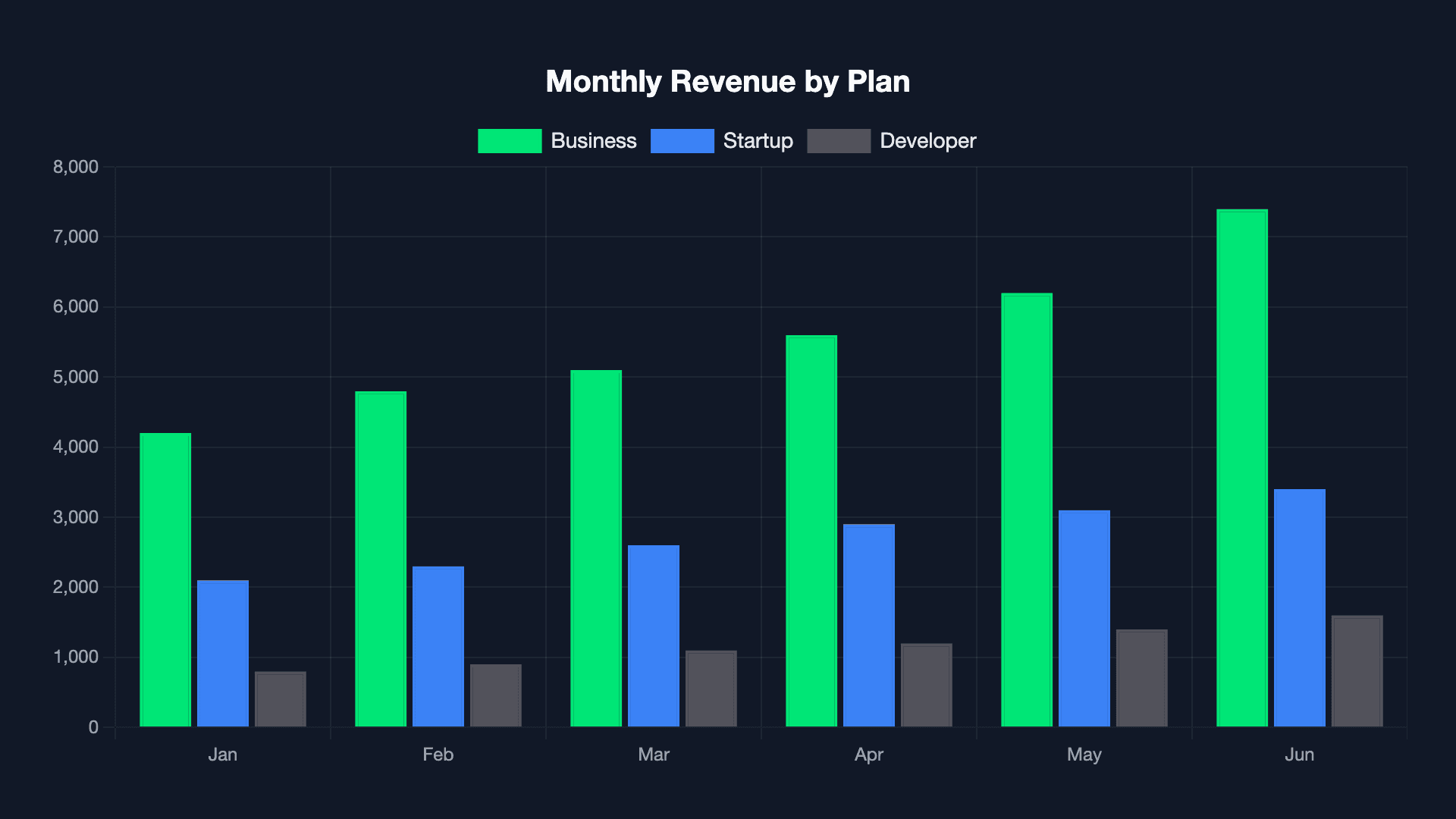
Bar Chart — Revenue Breakdown
Monthly revenue by plan tier as a bar chart PNG. Drop into any email or dashboard screenshot.
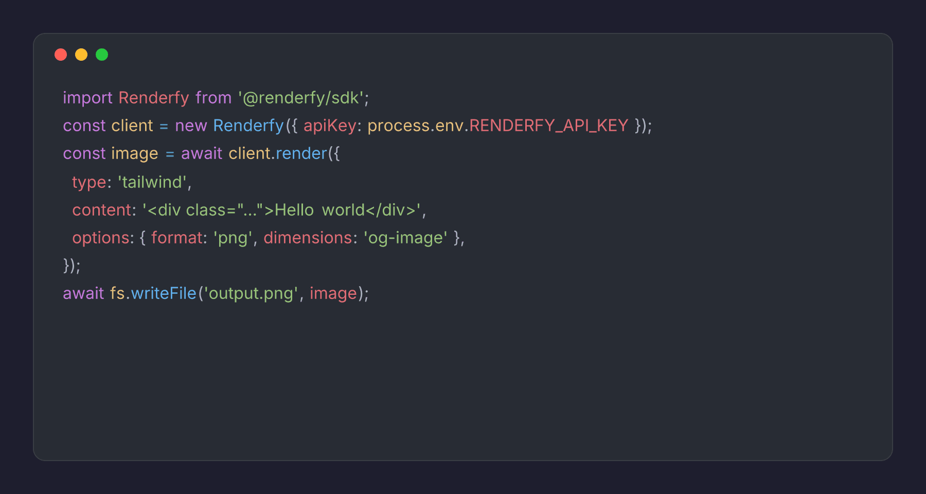
Code Snippet Card
Turn any code block into a shareable image. Shiki syntax highlighting, macOS window chrome.